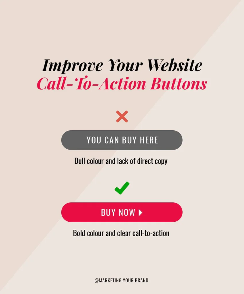
❌🙊 ARE YOUR CALL-TO-ACTIONS MORE LIKE CALL-TO-INACTIONS? ⤵️
Call-to-actions tell online visitors exactly what you want them to do. Getting these right can make a HUGE difference in your sales and conversions.
There’s been EXTENSIVE studying and testing done around call-to-actions and it really boils down into a couple of simple points:
✅ Make CTA buttons BOLD and COLOURFUL to attract attention.
This typically means using a CONTRASTING colour to your brand colours so it doesn’t blend in.
Red, blue, green, and orange tend to work best, while colours like grey or white go unnoticed.
✅ Make button copy CLEAR and DIRECT to inspire action.
Phrases like “Buy Now”, “Add To Cart”, “Shop Now”, and “View More” do well – but notice how each is slightly different.
For example, using “Add To Cart” on products in shops with multiple items means you’ll see a higher average order value as people will be more likely to continue browsing. While “Buy Now” pushes them to checkout instantly without browsing further.
➡️ Are your CTAs bold and clear? Leave your answers in the comments below.
I’m the brains (& the energy) behind MYB Workshops.
For 20+ years, I’ve helped business owners ditch the confusion, clarify their message, and build brands that attract the right clients. No fluff, no overwhelm, just proven strategies that work.
If you want to build a brand that feels right and actually brings in business, you’re in the right place!


I’m the brains (& the energy) behind MYB Workshops.
For 20+ years, I’ve helped business owners cut through the noise and build a brand that actually works.
I’m glad you’re here!
If your brand isn’t attracting the right customers, something needs to change.
In MYB Workshops, you get proven strategies, expert guidance, and a clear plan that actually works.
Brand confusion costs sales. Learn how to position, market, and sell with confidence inside MYB Workshops.
Crafting Your Brand Identity
An on-demand workshop to help you create a brand identity that attracts the right clients, builds trust, and drives real results, without the guesswork.
PLUS Grab your FREE workbook to implement everything instantly!
3 seconds. That’s all it takes for a visitor to decide if they’ll stay or leave your website.
Download this FREE guide to learn 6 proven strategies to keep visitors engaged and turn them into paying clients.
Your brand is more than a logo. It’s the foundation of your entire business.
If you skip this step, you risk wasting time and money on marketing that doesn’t convert.
Download this FREE guide and discover 5 key steps to build a brand that attracts, connects and drives long-term success.