Clear navigation is the foundation of an effective website. Without it, visitors cannot find what they need, and your business pays the price in lost leads and lower sales. Whether you run a service business or an online shop, the structure of your site menus directly shapes how long visitors stay, what they click, and whether they take action. Research from the Nielsen Norman Group and W3C confirms that navigation shapes content visibility for users and search engines alike. This article explains why websites need clear navigation, what the evidence shows, and what you can do about it today.
Clear navigation reduces confusion and helps visitors find what they need quickly. The W3C/WAI guidance on site structure describes this as “guessability on the first try.” That means a visitor landing on your site for the first time should be able to look at your menu and immediately understand where to go. When that does not happen, they leave.
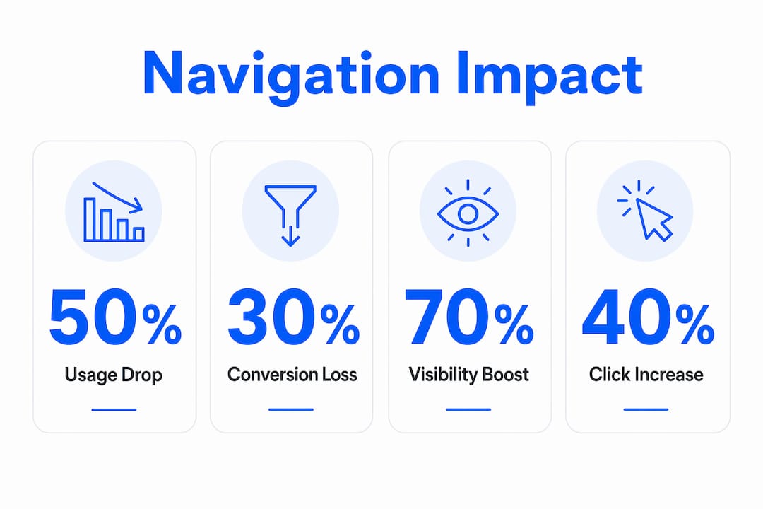
The Nielsen Norman Group tested navigation visibility across 179 participants on six live websites. Hiding primary navigation behind a hamburger menu on desktop caused users to use it 27% of the time, compared to 48–50% when the menu was fully visible. Content discoverability dropped by 20%, and task completion slowed by at least 39%. Those are not small differences. They represent real visitors failing to find your services, your pricing, or your contact page.

Good navigation also matches the way different people think about your site. Some visitors scan menus. Others search. Others follow links from page to page. Clear page structure supports all of these behaviours by grouping related content logically and placing menus in consistent, predictable positions. When your site layout matches what visitors expect, they spend less mental energy figuring out where they are and more time engaging with your content.
The key qualities of navigation that supports user experience are:
Pro Tip: Test your navigation with someone who has never seen your site before. Ask them to find your most important page without any guidance. If they hesitate or click the wrong link, your labels or structure need work.
Navigation is a conversion system, not just a design choice. Poor navigation reduces trust, increases effort, and sends visitors away before they reach your calls to action. GoDaddy’s 2026 guidance on website navigation confirms that clear, intuitive menus lead to longer visits, more page views, and higher action rates. The reverse is equally true: confusing navigation drives visitors away quickly, regardless of how good your content is.
The most compelling evidence comes from a live A/B test run on the Next ecommerce website. The test compared a visible navigation style called “Snail Trail” against a hamburger menu approach. The visible navigation delivered 50–70% higher click-throughs and a 0.5 percentage point conversion uplift. The hamburger menu reduced sales with a 0.35 percentage point drop in conversion. The estimated revenue difference was £135 million. That figure makes the business case for visible navigation impossible to ignore.
The table below summarises how different navigation styles affect conversion outcomes.
| Navigation style | Visibility | Click-through impact | Conversion impact |
|---|---|---|---|
| Fully visible menu | High | 48–50% usage rate | Positive uplift |
| Hamburger menu (desktop) | Low | 27% usage rate | Negative impact |
| Snail Trail (visible tabs) | High | 50–70% higher clicks | +0.5 percentage point |
| Hidden hamburger (ecommerce) | Low | Reduced discoverability | -0.35 percentage point |
The pattern is consistent across different sites and industries. Hiding navigation reduces the number of visitors who explore your site. Fewer explorers means fewer enquiries, fewer purchases, and fewer returning clients. Navigation choices that feel like minor design decisions carry measurable financial consequences.
Pro Tip: Before changing your navigation, run a simple task-based test. Ask five people to complete a specific action on your site, such as finding your pricing or booking a call. Count how many clicks it takes. If the average is more than three, your navigation is creating friction.
Search engines read your navigation to understand your site’s structure and priorities. When your menus are clear and logical, crawlers can follow links efficiently and index your pages correctly. When navigation is confusing or inconsistent, important pages may be missed or ranked poorly because the crawler cannot determine their relevance.
The Information Architecture Authority describes navigation as making your organisational architecture “operationally visible.” For search engines, this means your menu structure signals which pages matter most. A well-structured navigation with consistent anchor text tells Google that your services page, for example, is a priority. A buried or inconsistently labelled page sends the opposite signal.
Practical ways clear navigation supports both users and search engines include:
Confusing navigation creates a compounding problem for SEO. If visitors cannot find a page, they do not link to it, share it, or spend time on it. Low engagement signals to search engines that the page is not valuable. Clear navigation protects your rankings by keeping visitors on your site longer and directing them to your most important content.
Improving your navigation does not require a full website rebuild. It requires a clear process and a willingness to test what you find. Start with an honest audit of your current structure before making any changes.
Follow these steps to evaluate and improve your navigation:
Beyond structure, label clarity matters enormously. Your menu labels should describe exactly what a visitor will find when they click. Avoid internal jargon or branded terms that only your team understands. A visitor who has never heard of your business should be able to read your menu and immediately understand what you offer.
Responsive navigation deserves particular attention. A menu that works well on desktop may collapse into an unusable state on mobile. Test your navigation on multiple devices and screen sizes. Place your most important links, such as your services page and contact page, where they are accessible without scrolling or extra taps on every device.
Multiple navigation mechanisms also serve visitors with different needs and preferences. Some people prefer browsing a menu. Others use search. Others follow breadcrumbs back through your site. Offering all three means no visitor is left without a path forward. This is not just good accessibility practice. It is good business practice.
Clear, visible navigation is the single most direct lever website owners have to improve both user experience and conversion rates.
| Point | Details |
|---|---|
| Visible menus convert better | Hidden navigation reduces usage by nearly half and lowers conversion rates measurably. |
| Navigation is a conversion tool | Treat your menu structure as part of your conversion system, not just your site design. |
| SEO depends on clear structure | Logical menus and consistent anchor text help search engines index and rank your pages correctly. |
| Multiple pathways serve more visitors | Offering search, breadcrumbs, and menus alongside each other meets diverse user needs and accessibility standards. |
| Test before you change | Task-based testing with real visitors reveals navigation problems that internal reviews miss. |
Your website navigation is one of the most direct factors affecting how many visitors become paying clients. If your site is getting traffic but not converting, the structure and clarity of your menus may be a significant part of the problem. Mybworkshops runs expert-led workshops specifically designed for service-based business owners who want to fix underperforming websites and build sites that actually generate leads.

The website strategy and UX workshop covers navigation structure, conversion rate principles, and practical site planning in a format built for business owners, not developers. You will leave with a clear plan for your site structure and the confidence to implement it. Browse the full range of available workshops to find the right starting point for where your business is right now.
Clear website navigation is a site menu system that is visible, logically organised, and easy to understand on first use. It allows visitors to find any page quickly without confusion or extra clicks.
Poor navigation reduces the number of visitors who reach your calls to action. A live A/B test on the Next ecommerce site showed that hidden navigation caused a 0.35 percentage point drop in conversion, while visible navigation delivered a 0.5 percentage point uplift.
No. Nielsen Norman Group research shows that hamburger menus on desktop reduce navigation usage from 48–50% to 27% and slow task completion by at least 39%. Visible menus consistently outperform hidden ones on desktop devices.
Most usability guidance recommends no more than seven top-level menu items. More than that creates cognitive overload and makes it harder for visitors to decide where to click.
Yes. Search engine crawlers use your navigation to understand site hierarchy and identify priority pages. Clear menus with consistent anchor text improve crawl efficiency and support better rankings for your most important pages.