

Your pricing page needs to do one job well: show the right buyer exactly which plan fits them, at a price they can’t misread, with a button they can’t miss. Start with three tiers, one clearly recommended, a total price with no hidden extras, and a CTA that’s visible without scrolling. Two changes matter most straight away: make prices prominent, not buried in fine print, and stack everything vertically on mobile, with a sticky CTA that follows the reader down the page.
TL;DR:
- Using two to four clearly named plans with one recommended option improves decision speed and reduces buyer hesitation.
- Prominently display total prices with labels per user, month, or seat, and disclose surcharges before checkout to comply with legal requirements.
- Choose a layout based on your buyer type: card stacks for quick decisions or detailed matrices for technical comparisons, with mobile stacking as essential.
- A well-optimized page loads quickly by lazy-loading scripts, compressing content, and avoiding heavy embedded features, especially on mobile.
- Ensure a seamless transition from pricing to checkout by maintaining plan choices and prices, and tailor content and pricing to specific international markets.
You don’t need to reinvent the wheel here. Most high-converting pricing pages borrow from a small set of patterns, and knowing which one suits your product saves weeks of guessing. Figma’s own research into pricing page best practices points to the same handful of components showing up again and again: clear tier limits, comparison tables, tooltips, and sticky calls to action.
Here are the patterns worth studying and copying:
For broader visual inspiration, curated design galleries and screenshot archives are a faster way to see live examples than scrolling competitor sites one by one.
Conversion rarely comes down to clever design tricks. It comes down to a short list of disciplined rules, applied consistently.
Pro Tip: Test your recommended-plan badge copy before you test anything else on the page. Which plan gets the badge, and what the badge says, tends to move more revenue than font choices or colour schemes ever will.
The layout decision comes down to how much your buyer needs to compare before deciding. A card layout suits products with two or three clearly different buyer types making a fast choice. A full matrix suits technical or enterprise buyers who need to check specific feature rows before committing budget, a pattern Baymard’s research into subscription service UX confirms buyers actively look for when comparing plans side by side.
On mobile, none of this works if it’s not stacked. Vertical card stacking is now standard practice, with 78% of studied SaaS sites using it for exactly this reason.
Under Australian Consumer Law, you must show the total minimum price a customer will pay, including any unavoidable fees or taxes, before they commit. The ACCC’s price display guidance makes this explicit: drip pricing, where extra unavoidable costs appear only at checkout, is prohibited.
If a surcharge applies (a payment-method fee, for instance), it must be shown at least as prominently as the base price, not tucked into a footnote. Practically, this means placing the full price directly beside the CTA, using whole numbers where possible, and labelling clearly whether the figure is per user, per month, or per seat. A price that reads “$49” without a label invites a support ticket and a lost sale in the same moment.
A feature matrix only helps if it surfaces the differences that change a buyer’s budget or rollout plan. Everything else is noise that slows the decision down.
That last point matters more than most designers assume: a procurement officer or manager who never lands on your page directly often needs a clean summary to forward to their own decision maker.
Not every element deserves equal testing effort. Some changes move revenue meaningfully; others just move pixels. Test in roughly this order:
Use a simple ICE score (impact, confidence, ease) to rank test ideas before you build them, and measure revenue per visitor and qualified demo requests as your primary outcomes, not clicks alone. Layer in heatmaps and session recordings alongside your funnel analytics. Numbers tell you what changed; recordings tell you why.
Before a page goes live, run it against this list:
<th> tags, not styled <div>s).Four templates to adapt:
Pro Tip: Run a keyboard-only pass on your own page before launch. Tab through every plan card and toggle. If you can’t reach the CTA without a mouse, neither can a portion of your audience.
Psychological pricing isn’t a trick, it’s a reflection of how people actually scan numbers under time pressure. Charm pricing (ending a figure in $9 rather than a round $10) still tests well because buyers read the left-most digit first and register it as meaningfully lower, even when the gap is a single dollar.
The decoy effect works differently. When you place a deliberately weaker middle option next to your target plan, the target suddenly looks like the obvious choice by comparison. A three-tier structure where the middle plan is priced close to the top plan but with far less included often pushes buyers toward the top tier, because the perceived value gap looks small next to the price gap.
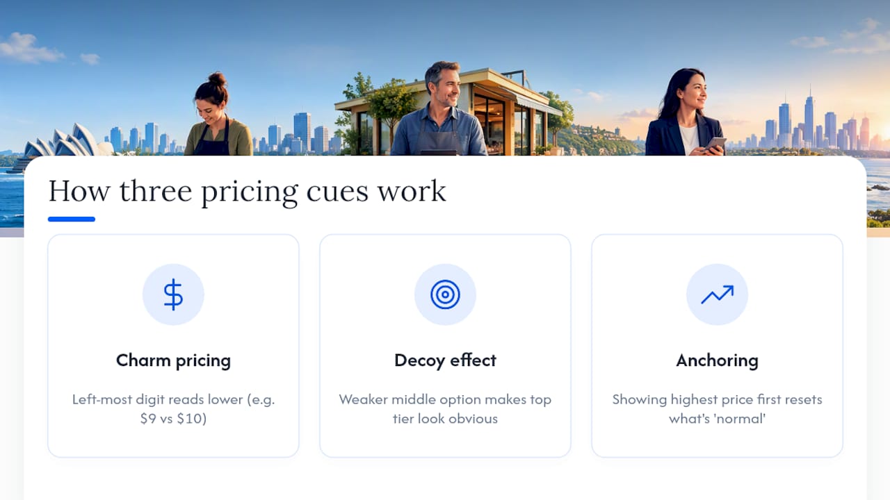
Anchoring plays a related role: placing your highest-priced plan first, before the buyer has seen anything cheaper, resets their sense of what’s “normal” for the category. Everything after that first number reads as more reasonable by comparison, even when nothing about the middle tier’s actual price has changed. This is a well-documented pattern in pricing psychology, and it’s worth testing deliberately rather than accepting whatever column order feels natural.
None of these techniques work if they read as manipulative. The line between smart pricing psychology and a page that feels like a trick is thin, and buyers notice when a “recommended” badge sits on the plan that clearly benefits the seller more than them. Use these patterns to clarify a genuine best fit, not to nudge people toward a plan that doesn’t suit them.
Yes, and it matters more on a pricing page than almost anywhere else on your site. This is the page where a buyer has already decided they’re interested and is actively comparing numbers. Any delay at that exact moment reads as friction, and friction at the point of commitment is where deals quietly die.
Heavy pricing pages are common because they’re often built late, stacked with marketing widgets, embedded calculators, and tracking scripts added one at a time over months. A comparison table with dozens of tooltip scripts, a live usage calculator, and three chat widgets loading simultaneously will feel sluggish even on a fast connection.
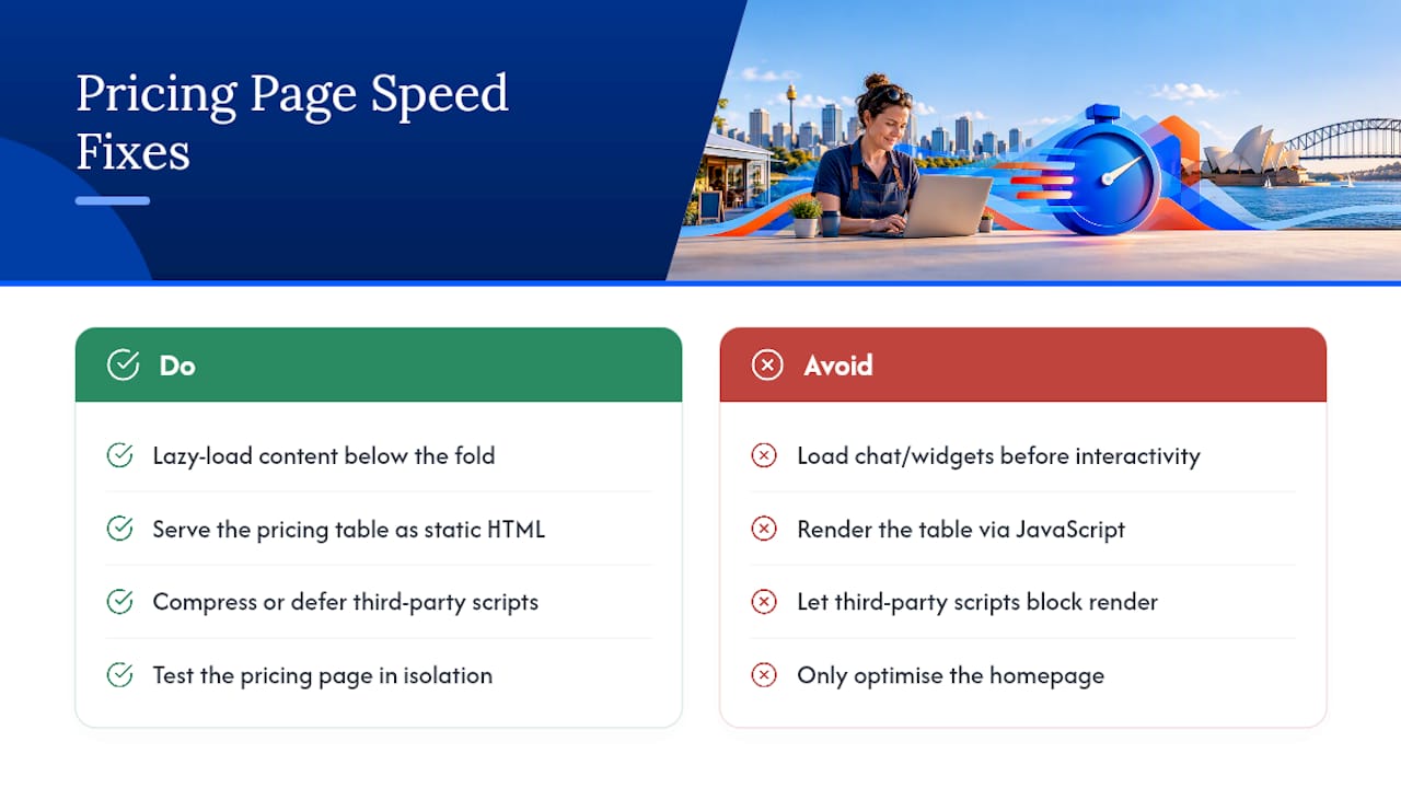
Practical fixes are straightforward. Lazy-load anything below the fold, particularly testimonial carousels and embedded videos. Keep the pricing table itself as static HTML rather than a JavaScript-rendered component wherever possible, since that’s the content a buyer needs first. Compress or defer third-party scripts, especially chat widgets and analytics pixels that don’t need to fire before the page is interactive. If your page uses a live calculator, make sure it doesn’t block the rest of the page from rendering while it initialises.
Test your pricing page in isolation, not just your homepage. It’s common for teams to optimise the homepage for speed and forget that the pricing page carries its own separate weight of scripts and embeds.
The gap between “I’ve chosen a plan” and “I’ve paid” is where a lot of otherwise well-designed pricing pages leak revenue. The handoff needs to feel like one continuous decision, not two separate systems bolted together.
Practically, this means the plan a buyer selects on the pricing page should carry through to checkout without them having to deselect it, re-enter details already provided, or wonder whether their choice registered. If your pricing page includes an annual/monthly toggle, checkout needs to reflect whichever option was selected, not default back to monthly.
Show the same total price at checkout that was shown on the pricing page. Any discrepancy between the two, even a legitimate one like a tax adjustment based on billing address, needs a plain-language explanation right there, not a surprise on the final confirmation screen. This is the same principle behind the ACCC’s total-price rule: what the buyer sees first should match what they’re charged.
Keep the checkout form itself short. Ask for payment details and the minimum account information needed to activate the product, and push anything else (company size, industry, onboarding preferences) to after signup, when the buyer has already committed. A checkout form that feels like a second sales pitch, rather than a formality, is where hesitant buyers change their mind.
A pricing page built for one market rarely performs the same way once you start selling internationally, and currency is only the most visible part of the problem. Showing a price in a buyer’s local currency, rather than forcing a mental conversion from another currency, measurably reduces the hesitation buyers feel at the point of decision.
Beyond currency, round-number psychology doesn’t translate directly. A price ending in $9 doesn’t carry the same psychological weight in every currency, since the perceived “cheapness” of a charm price is partly a function of how that currency’s smallest common denominations are usually written. Some markets are more accustomed to round pricing than others.
Language adaptation goes further than translating plan names. Buyer-fit subtitles (“For growing teams”) need local rephrasing that matches how businesses in that market actually describe their own size and structure, not a literal translation. Legal and tax display requirements also vary by jurisdiction. What counts as an unavoidable fee that must be shown upfront under Australian rules won’t necessarily match another country’s disclosure requirements, so a pricing page serving multiple markets needs region-specific compliance checks, not one global template applied everywhere.
Everything covered above, buyer-fit tiers, transparent pricing, mobile-first layout, is a lot easier to execute well when it sits inside a proper website strategy rather than being bolted on as an afterthought. That’s the gap Mybworkshops workshops are built to close: structured, step-by-step sessions that pair practical templates with real feedback, rather than another generic course you watch once and forget.

If pricing page design is the problem you’re solving right now, the Plan a Website That Converts – Strategy, Structure & UX Workshop walks you through exactly how pricing fits into your broader site structure, not as an isolated page but as part of the full buyer journey. Pair it with the Compelling Homepage Copy Workshop and the Write Winning Product & Service Pages Workshop if your copy needs the same attention as your layout. Participants leave each session with hands-on templates, direct feedback on their own draft, and a follow-up checklist to work through afterwards, not just a recording to rewatch.
If you’d rather build the visual side yourself first, the Canva template shop has ready-made social and brand assets you can adapt while you work through your page structure. And if you’re not sure which workshop fits your current stage, the Free Masterclass: Build A Better Business is a solid, no-pressure place to start.
The best design shows two to four clearly named tiers, one marked as recommended, with the total price displayed in full next to a visible CTA. Beyond that, the layout depends on your buyer: cards suit fast, simple choices, while a full matrix suits technical buyers comparing feature rows in detail.
Start with buyer research to define who each tier serves, then write outcome-driven descriptions before touching layout. Build mobile-first with stacked cards and a sticky CTA, display the total price clearly per the ACCC’s rules, and test one element at a time rather than redesigning everything at once.
Pricing for website design work varies enormously depending on scope, and there’s no single industry-standard figure to quote. If you want a structured way to think through your own pricing and positioning rather than guessing at a number, the Business Strategy Workshop covers this directly; current pricing details are available on their website.
A pricing page is the section of a website where visitors compare plans or packages and decide which one to buy, typically showing tiers, features, and a call to action side by side. It’s often the last page a buyer visits before checkout, which makes clarity and trust more important there than almost anywhere else on the site.