
Why mobile website design matters for your business

Australian man testing mobile website at home

Your mobile website is where most Australians first encounter your business, and if it performs poorly, they leave within seconds. Mobile devices drive the majority of Australian web traffic, yet mobile visitors convert at a notably lower rate compared to desktop. That gap is not a technical curiosity. It is lost revenue sitting in your analytics right now.

The short version:

  • Mobile generates the majority of Australian web traffic but converts at roughly half the desktop rate
  • Google’s mobile-first indexing means your mobile site determines your search rankings, not your desktop version
  • Poor mobile experience raises bounce rates, weakens trust, and increases your cost per lead
  • Three priorities close most of the gap: speed, simplified forms, and digital wallet support

Table of Contents

What does the mobile conversion gap actually cost you?

Australian mobile commerce data shows smartphones influence almost every stage of the buying journey, from discovery through to purchase. Yet desktop converts at roughly double the rate of mobile, and mobile users bounce more frequently than desktop users.

For a service business receiving a typical volume of monthly mobile visitors, improving the conversion rate to a higher level yields substantially more enquiries from traffic you are already paying to attract. That is the business case for mobile optimisation in one sentence.

Poor mobile experience also harms your SEO. Google evaluates the mobile version of your site to determine rankings. A slow or broken mobile experience pushes you down in local search results, which raises your cost per acquired lead across every channel, including paid ads.

Key figure: Top-performing mobile sites achieve significantly higher conversion rates than average mobile sites. The gap between average and excellent is entirely closeable with deliberate optimisation.


Common mobile design problems that kill leads

Most mobile sites lose leads through the same handful of issues. Recognising them on your own site is the first step.

  • Slow load times (LCP above 2.5s): Mobile sites loading under two seconds can convert at up to double the rate of slower pages. Every extra second costs you visitors.
  • Layout shift (CLS above 0.1): Buttons and text that jump around as the page loads frustrate users and cause accidental taps.
  • Slow interactive readiness (INP): Pages that look loaded but do not respond to taps immediately feel broken.
  • Tiny tap targets: Buttons smaller than 44×44 pixels cause mis-taps and abandonment.
  • Long or fiddly forms: Complex forms and multi-step checkouts are among the most common causes of mobile abandonment.
  • Hidden or hard-to-reach CTAs: If your phone number or enquiry button is not visible above the fold, most mobile visitors will not search for it.
  • Broken payment flows: No digital wallet support, or a checkout that requires too many steps, drives abandonment at the final moment.
  • Intrusive pop-ups: Pop-ups that cannot be closed on a small screen cause immediate exits and Google penalties.

Non-responsive sites lose a substantial share of mobile visitors immediately, but even technically responsive sites can still fail on all of the above points.

Pro Tip: The fastest way to spot a broken payment flow is to complete your own checkout on a real phone using only your thumb. Time it. If it takes more than 90 seconds or requires you to type card details manually, your abandonment rate is high and digital wallet support should be your first fix.

Quick fixes (image compression, tap-to-call links, button sizing) take hours to days. Structural problems like navigation architecture, form redesign, and checkout flow require a developer and proper planning.


A practical mobile-first priority checklist for business owners

Mobile-first design is a philosophy, not just a technical setting. It means designing from a 375px screen width upward, so the phone experience is deliberate rather than squeezed. Work through these in order.

  1. Audit and measure first. Run Google PageSpeed Insights on your key pages. A mobile score below 70 signals real problems. Check your mobile conversion rate in Google Analytics before you change anything, so you have a baseline.
  2. Speed optimisations. Compress images to WebP format, enable browser caching, and remove unnecessary scripts. These are often DIY-friendly on platforms like WordPress or Squarespace.
  3. Simplify navigation and CTAs. Use a collapsing hamburger menu. Place your primary call-to-action (phone number, enquiry button) in the header on every page as a tappable link.
  4. Streamline forms and checkout. Reduce fields to the minimum you actually need. Enable guest checkout, minimise required fields, and support digital wallets such as Apple Pay and Google Pay.
  5. Accessibility and tap-size checks. Body text at 16px minimum, buttons at 44×44px minimum, and sufficient spacing between links.
  6. Test on real devices. iOS dominates Australian mobile traffic, so test on an iPhone first, then Android.

Responsive web design best practices cover the technical side in detail if you want to go deeper.

Pro Tip: Install Microsoft Clarity (free) on your site for one week. The session recordings will show you exactly where mobile users tap, scroll, and abandon. Five recordings will tell you more than an hour of guessing.


What to measure and sensible targets for mobile performance

Tracking the right metrics keeps you focused on changes that actually move revenue. Here are the ones that matter most for a service business.

Woman reviewing mobile site on tablet in office

Metric What it measures Target Quick action
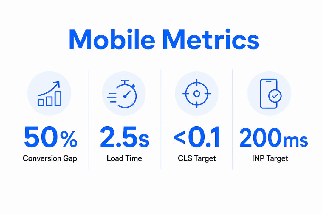
LCP (Largest Contentful Paint) How fast the main content loads Under 2.5 seconds Compress images, use WebP
CLS (Cumulative Layout Shift) Visual stability during load Under 0.1 Set image dimensions, avoid late-loading ads
INP (Interaction to Next Paint) Responsiveness to taps Under 200ms Reduce JavaScript, defer non-critical scripts
Mobile conversion rate Leads or sales from mobile visitors Aim above 2.5% Simplify forms, add digital wallets
Checkout completion rate Visitors who finish checkout Improve from baseline Reduce steps, enable guest checkout
Mobile bounce rate Single-page exits on mobile Improve speed and above-fold clarity
Digital wallet usage Share of payments via Apple/Google Pay Track and grow Enable in payment settings

Infographic with key mobile website performance metrics

Continuously auditing load times, checkout completion, and payment friction is ongoing work, not a one-off project. Mobile behaviour evolves, and wallet adoption in Australia is growing fast. Understanding your website conversion rate gives you the baseline to measure every improvement against.


Realistic timelines and cost bands for fixes in Australia

Not every mobile problem requires a full rebuild. Here is a practical guide to what each level of work involves and what it typically costs in the Australian market.

  • Quick fixes (days to 2 weeks, roughly $300–$1,500): Image compression, tap-to-call links, button sizing, pop-up removal, and basic speed improvements. Often DIY-friendly on modern platforms. High ROI relative to cost.
  • Optimisation sprint (2–8 weeks, roughly $1,500–$5,000): Form redesign, checkout simplification, digital wallet integration, navigation restructure, and Core Web Vitals improvements. Requires a developer for most platforms.
  • Mobile-first redesign (8–16+ weeks, roughly $5,000–$20,000+): Full rebuild starting from mobile constraints, new content hierarchy, and proper performance testing. Warranted when the existing site has structural problems that incremental fixes cannot resolve.
  • Ongoing maintenance: Monthly or quarterly audits to catch regressions, test new device types, and track wallet adoption. Budget $300–$800 per month for a developer retainer, or build the habit of running PageSpeed Insights yourself.

Practical audits and small fixes often yield rapid wins, and businesses that treat mobile as an ongoing channel see better long-term revenue stability. Start with the quick fixes, measure the conversion uplift, and use that data to justify a larger investment if needed. Reviewing your website elements that lose leads before briefing a developer saves time and money.


When should you DIY, and what to ask a supplier?

Deciding whether to do it yourself

Use this checklist to make the call:

  • DIY is reasonable if your site is on a modern platform (Squarespace, Wix, Shopify, WordPress with a quality theme), the issues are speed and content-related, and you have 4–6 hours to invest.
  • Hire a developer when problems involve checkout architecture, custom code, broken navigation, or Core Web Vitals failures that PageSpeed Insights flags as requiring code changes.
  • Join a structured programme when you need to understand the full picture, brief a supplier confidently, and build a site that converts, not just one that looks good on a phone.

Questions to ask any supplier before you commit

  1. Can you show me before-and-after Core Web Vitals scores from a recent project?
  2. How do you test on real mobile devices, and which ones?
  3. What mobile KPIs will you commit to improving, and how will you report on them?
  4. Will you hand over the site with documentation, or do I need you for every future change?
  5. What does ongoing optimisation look like after launch?

A supplier who cannot answer questions 1 and 3 with specifics is not treating mobile performance as a measurable outcome. The website credibility checklist for small business owners is a useful reference when evaluating what a finished site should deliver. Local search visibility also depends on factors beyond your site itself — Google Maps ranking factors interact with your mobile experience in ways that affect how often you appear in “near me” searches.


Key takeaways

A poor mobile experience directly reduces lead volume because mobile drives the majority of Australian web traffic while converting at roughly half the desktop rate.

Point Details
Mobile conversion gap Australian mobile converts at roughly half the desktop rate; closing that gap is the core business case.
Google mobile-first indexing Your mobile site determines your search rankings, regardless of how good your desktop version looks.
Top three quick wins Speed (images, caching), simplified forms (fewer fields, guest checkout), and digital wallet support.
Measure before you change Set a baseline mobile conversion rate in Google Analytics before any fixes, then track uplift.
Mybworkshops Mybworkshops workshops give service business owners the skills and frameworks to brief suppliers, fix conversion issues, and build sites that generate leads consistently.

Mybworkshops can help you close the mobile conversion gap

If this article has surfaced problems you are not sure how to fix, or you want to brief a developer with confidence rather than guessing, Mybworkshops workshops are built for exactly that situation.

Mybworkshops

The Mybworkshops programme gives service-based business owners a structured way to understand what their website should be doing, identify what is holding it back, and build a clear plan to fix it. Rather than handing the problem to a supplier and hoping for the best, you leave with the knowledge to direct the work, measure the results, and hold anyone you hire accountable to real outcomes.

Real results from past participants are documented on the Mybworkshops examples page, and the lead generation system workshop is a practical starting point for owners who want their website to work as a lead generation tool, not just a digital brochure.

Browse the full workshop catalogue to find the session that fits where you are right now.


Useful sources and further reading

  • Mobile commerce in Australia | Stripe — Australian mobile traffic share and practical checkout optimisation guidance including digital wallets.
  • Australian mobile traffic data | RockingWeb — Conversion rate benchmarks (1.8% mobile vs 3.2% desktop), bounce rate data, and the 3.9% top-performer figure.
  • Mobile eCommerce statistics Australia | Marketix Digital — Speed-to-conversion relationship and how smartphones influence the full buying journey.
  • Mobile-first indexing explained | Media Components — How Google’s mobile-first indexing works and the 375px design philosophy.
  • Responsive web design and conversions | TitanBlue — How responsive design reduces bounce rates and improves SEO signals.
  • Conversion rate benchmarks | Digital Applied — Friction sources and conversion benchmarks across channels.
  • Speed and SEO | TopSEO Sydney — Why ongoing measurement of load times and checkout completion matters.
  • Mobile-first web design for Australian businesses | Websites That Sell — Staged optimisation approach and the case for treating mobile as an ongoing channel.

FAQ

Why does mobile website design matter for lead generation?

Mobile drives the majority of Australian web traffic, but converts at roughly half the desktop rate. Fixing speed, forms, and payment friction directly increases the number of leads your existing traffic produces.

What is the difference between mobile-friendly and mobile-first?

A mobile-friendly site adapts to smaller screens; a mobile-first site is designed starting from a 375px phone screen and scaled up. Mobile-first produces a genuinely better phone experience because constraints are built in from the start, not added later.

How does mobile design affect my Google rankings?

Google uses mobile-first indexing, meaning it evaluates and ranks your site based on the mobile version. Slow load times, layout instability, or missing content on mobile will lower your rankings regardless of how well your desktop site performs.

What are the Core Web Vitals targets I should aim for?

Target LCP under 2.5 seconds, CLS under 0.1, and INP under 200ms. Google PageSpeed Insights measures all three and flags which need attention.

How quickly can mobile fixes improve conversions?

Speed and form improvements can show measurable conversion uplift within weeks of deployment. Moving from a 1.8% to roughly 3.9% mobile conversion rate (the benchmark for top-performing sites) represents significantly more leads from the same traffic volume.


Hi There, I'm Peggy

I’m the brains (& the energy) behind MYB Workshops.

For 20+ years, I’ve helped business owners ditch the confusion, clarify their message, and build brands that attract the right clients. No fluff, no overwhelm, just proven strategies that work.

If you want to build a brand that feels right and actually brings in business, you’re in the right place!

Hi There, I'm Peggy!

For more than 20 years, I’ve helped businesses grow with better marketing systems that support long-term plans.

Everything inside MYB Workshops is built from the same strategies, frameworks and practices we use in our agency. These aren’t theories or quick fixes. They’re proven approaches shaped by real-world results and applied across hundreds of businesses.

MYB Workshops was created to make those tools and insights accessible to business owners who want greater clarity and confidence in their business.

I’m glad you’re here in the Blog, explore some of the hot topics our clients ask us about. I hope to see you in the workshops, real soon!

Build Your Business

If your business isn’t attracting and converting the right customers, something needs to change.

In MYB Workshops, you get proven strategies, expert guidance, and a clear plan that actually works. 

Start building a marketing system that works, today!

Stop Losing Sales

Brand confusion costs sales. Learn how to position, market, and sell with confidence inside MYB Workshops.

FREEBIES
FREE Brand Clarity Workshop

Crafting Your Brand Identity 

An on-demand workshop to help you create a brand identity that attracts the right clients, builds trust, and drives real results, without the guesswork.

PLUS Grab your FREE workbook to implement everything instantly!

6 Strategies to Build a Website That Converts

3 seconds. That’s all it takes for a visitor to decide if they’ll stay or leave your website.

Download this FREE guide to learn 6 proven strategies to keep visitors engaged and turn them into paying clients.

FREE Branding Guide

Your brand is more than a logo. It’s the foundation of your entire business.

If you skip this step, you risk wasting time and money on marketing that doesn’t convert.

Download this FREE guide and discover 5 key steps to build a brand that attracts, connects and drives long-term success.

Related Blog Articles