

The single biggest lever for form conversion is cutting visible fields to the fewest you genuinely need, stating your privacy and consent terms plainly, labelling every field so assistive technology can read it, and testing changes before you roll them out. Get these right and you improve completion rate, legal safety and lead quality all at once, as Baymard Institute research and ACMA guidance both confirm.
TL;DR:
- Use a one column layout, combine names, and reveal optional fields only when relevant; input masks, inline errors, and session prefill reduce avoidable typing friction.
- Record who consented, when, and through which channel; outsourcing messages does not transfer liability, and opt-outs must be honored within five working days.
- Keep unsubscribe links functional for at least 30 days, and place a short collection notice beside the form with a link to the privacy policy.
- Track form completion, time to finish, qualified lead rate, and page bounce; test one change at a time, then segment results by device and traffic source.
- Give every input a visible label linked through matching form identifiers, and check keyboard order and screen reader behavior before launch.
Before you touch design or copy, run through this list. Each item points to one thing to change and the metric it moves.
Each of these is small on its own. Together, they are the difference between a form that quietly leaks leads and one that earns its place on the page.
A single-column layout beats side-by-side fields almost every time, especially on a phone screen where two columns force a pinch-zoom before anyone can type. Group related fields together (name and email as one cluster, address as another) so the form reads as a short sequence of small decisions rather than one long list.
Progressive disclosure does a lot of the heavy lifting here. Show only the fields that apply to most visitors, then reveal extras (a second phone number, a referral source, a project budget range) only when the answer to an earlier question makes them relevant. This keeps the form short without losing the detail you need for well-qualified leads.
Baymard Institute’s research on input fields found that people are intimidated by pages showing a large number of visible fields, and that shrinking the list measurably lifts completion. The same principle plays out on mobile even more sharply: a cramped keyboard, tiny touch targets and a slow-loading page compound each other, so pair your field count reduction with properly sized buttons, the right input type for each field (a numeric keypad for phone numbers, for instance) and a page that loads fast on a 4G connection. If you want a broader audit of what else might be costing you leads on the page, our website conversion killers checklist is a useful next stop.
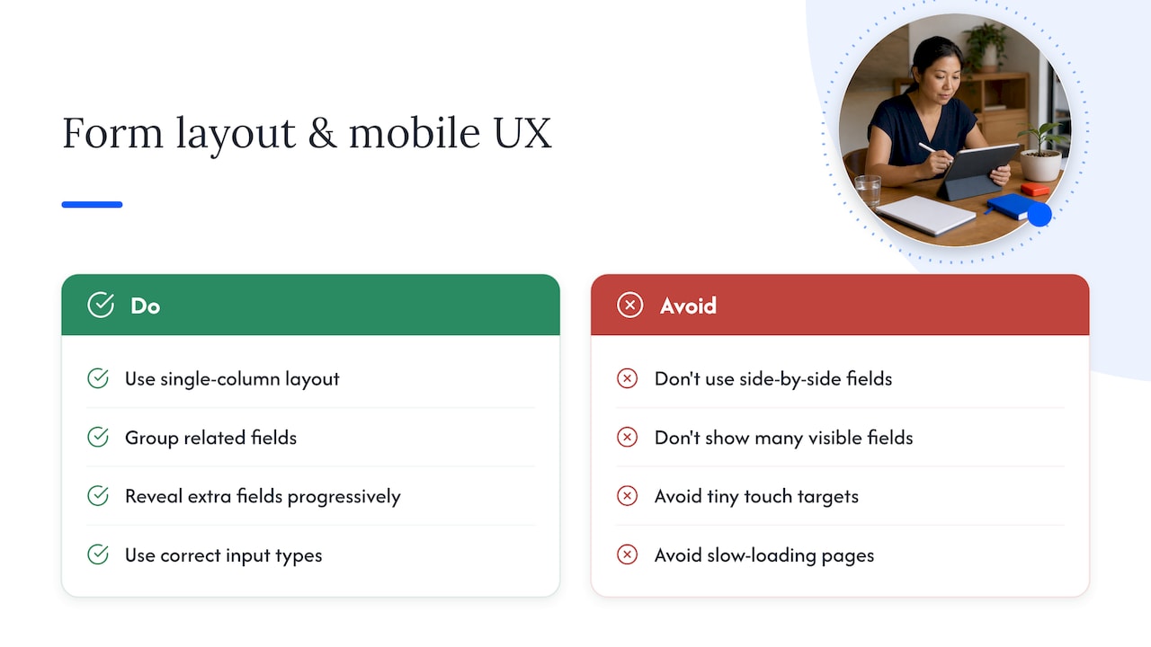
Every field on your form should earn its place. Ask yourself whether you can actually act on the answer; if a field exists “just in case,” it is costing you completions for no return. Keep strictly necessary fields (name, email, the one or two questions that help you qualify a lead) marked as required, and make everything else genuinely optional, with a clear visual cue showing which is which.
Combining first and last name into a single field is a small change that removes friction without losing information, since most CRMs can split a full name back out later. For phone numbers and dates, use input masks that guide the format as someone types, rather than rejecting their entry after the fact with a vague error message.
Inline validation, checked as the person moves from one field to the next, catches mistakes early and feels far less punishing than a wall of red text after submission. Keep error messages specific: “Please include an area code” helps; “Invalid entry” does not.
Where you can, use session-based prefill: if someone has already told you their email on an earlier step of your funnel, do not ask again. This saves typing without exposing anyone’s data to a third party, and it is one of the small touches that quietly raises completion rate across a multi-step funnel.
The words on your button matter more than most businesses expect. “Submit” tells a visitor nothing about what happens next; “Get my pricing guide” or “Book my free call” tells them exactly what they will get in return for their details. Match your field labels to the same specific tone: “Work email” instead of “Email,” “Preferred callback time” instead of “Phone.”
A well-chosen lead magnet does real work here too. The best ones are things a service buyer can actually use quickly, such as a checklist, a short pricing guide, or a planning template, and that you can fulfil reliably and promptly. If your lead magnet shows up in their inbox three days later, you have already lost most of the trust the form built. Our guide to building lead magnets for service businesses walks through the selection and fulfilment side of this in more detail.
Short, outcomes-focused proof near the form, a line about the kind of result past clients have seen, works better than a wall of logos. Keep it specific and keep it about outcomes, not about naming other providers in your space.
Consent needs to be collected deliberately, not assumed. ACMA’s guidance makes clear that businesses must obtain and keep records of express consent before sending marketing communications, including who consented, when, and through which channel. This matters even when a third party sends the messages on your behalf: a recent enforcement action saw Betfair pay $871,000 after a VIP program run by a third party breached spam rules, a reminder that outsourcing a send does not outsource the liability.
Your unsubscribe function needs to work, not just exist. ACMA expects an opt-out request to be actioned within five working days, and the unsubscribe facility itself needs to remain functional for at least 30 days from when a message was sent.
On the form itself, a short notice at or before the point of collection satisfies Australian Privacy Principle 5, according to OAIC guidance. A single sentence explaining what you collect and why, with a visible link through to your full privacy policy, is usually enough: you do not need to reproduce the whole policy on the form.
Every input on your form needs a visible label tied to it with matching for and id attributes, so screen readers can announce what each field is asking for. This is standard practice under W3C’s WCAG technique H44, and it is one of the most commonly missed items on forms that otherwise look polished.
Avoid reusing the same label text across different fields (two boxes both labelled “Name” with no distinction between a business name and a contact name, for instance), since that confuses assistive technology as much as it confuses a person skimming quickly. Add short contextual headings or helper text where a field’s purpose is not obvious from the label alone.
A few smaller checks round this out: confirm the keyboard tab order follows the visual order of the form, use ARIA attributes only where a native HTML element cannot do the job, and run the form through a screen reader at least once before launch. These checks take an afternoon and they catch problems that would otherwise sit invisible on your site for years.
Four numbers matter most: form completion rate, time to complete, qualified lead rate, and the bounce rate from the page the form sits on. Track all four, because a form that completes well but produces poor-quality leads is not actually working.
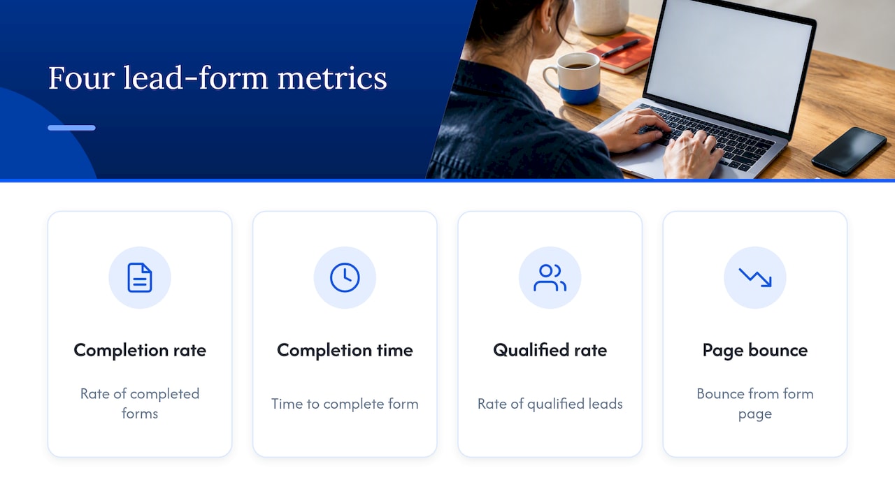
Good A/B tests for a lead form include field count, CTA wording, whether a lead magnet is offered, and how inline validation behaves. Run one change at a time where you can, so you know what actually moved the number.
Watch your sample size before declaring a winner, and segment results by device and traffic source: a change that helps mobile visitors can look flat or even negative in a blended result if desktop traffic dominates your data. A short holdout group, a slice of traffic that keeps seeing the old version, helps confirm a result is real rather than a short-term blip. Our website conversion rate optimisation workflow covers this testing cycle in more depth, and if paid traffic is part of your mix, Google Ad Guy has useful notes on tracking lead quality back to the channel it came from.
Work through these in order, and fix the compliance items first since they carry legal weight.
Reading a checklist is one thing; building a form that actually brings in qualified leads week after week is another. Our #7 Lead Generation System Workshop walks service business owners through building a complete lead capture and follow-up system, from the form itself through to the funnel that turns a submission into a booked client, with templates and AI tools you can apply straight away. It runs at $350 AUD per year with twelve months of access to the materials.
If you would rather see the full curriculum before committing to one workshop, our workshop catalogue lays out the whole structured programme, from brand messaging through to paid traffic, so you can see where lead generation fits into the broader system.
The most common mistake is asking for far more information than you need at the first point of contact, which Baymard Institute research links directly to lower completion. A close second is skipping clear consent and privacy notices, which creates legal exposure rather than just lost leads.
This usually refers to the idea that a fast response, ideally within the first few minutes of a lead submitting a form, dramatically improves your odds of converting them into a client, since interest fades quickly once someone moves on to other tabs or other providers. Set up an automated confirmation and a fast manual follow-up process so no lead sits untouched overnight.
There is no single tactic that works alone: the strongest approach combines a short, well-labelled form, a specific and relevant incentive, clear consent handling, and ongoing testing of what actually converts for your audience. Treating the form as one part of a larger system, rather than a standalone fix, tends to produce more durable results than chasing one quick change.
A simple, effective lead form for a service business might ask for a full name, a work email, and one qualifying question such as “What are you looking to achieve?”, paired with a specific CTA like “Get my free quote.” It would include a brief consent notice near the submit button and a visible link to the full privacy policy, keeping the whole form to three or four fields.