

Twelve pages that hold logo rules, three colour codes, one font pairing and two sentences telling your team how to sound: that’s what a working brand guide looks like. This article gives you a curated set of real, accessible brand style guide examples, a breakdown of what belongs in yours, and a small-business template you can fill out this week.
Copy this into a shared doc right now, before you read another word:
That’s your mini brand board. Everything from here builds on it: the examples to study, the sections a proper guide needs, a minimum-viable template, and how to actually put it to use across your website, social and email. If you’d rather have someone walk you through it, MYB Workshops runs a hands-on session for exactly this problem, but the free examples below will get you most of the way there on your own.
TL;DR:
- Small businesses should keep their brand style guide between three and five pages, focusing on core elements like logo, color, typography, imagery, and voice.
- Including real examples of social posts, email headers, and proposals helps ensure teams understand how to apply branding rules consistently.
- Use accessible hosting platforms such as Notion, Figma, or Google Docs, with clear sharing permissions and dedicated templates to keep the guide current and easy to update.
- Studying comprehensive guides like NASA’s or practical templates from Canva and HubSpot offers valuable insights into building a functional and visually consistent style guide.
- For rapid implementation, structured workshops or templates can transform initial ideas into a usable, living brand guide within a single session.
Good design education happens by looking at real work, not reading theory. Below are the guides worth bookmarking, ordered roughly from full corporate brand centres down to lean, single-page boards that suit a small service business far better. For each one, focus on the single idea flagged next to it rather than trying to absorb the whole document.
1. NASA’s brand guidelines. NASA’s is the standard reference point for how far a brand manual can go, and it’s freely accessible online. It covers the “meatball” logo, the retired “worm” mark, typography, colour, and even how the insignia sits on spacesuits. The NASA brand guidelines are worth opening even if you never need that level of detail, because they show what a genuinely airtight clearspace rule looks like when a wrong move is publicly visible. Copy this: the way every logo variation has an explicit “do not” example sitting right beside the correct one.
2. HubSpot’s brand style guide PDF. This is one of the most widely shared examples in marketing circles because it’s built for exactly the audience most guides ignore, namely marketers who aren’t designers. The HubSpot brand guide spells out logo lockups, colour codes and photography rules in plain language, with visual examples rather than abstract descriptions. Copy this: the way each rule pairs a short instruction with a picture, so nobody has to guess what “adequate clearspace” actually means.
3. Canva’s style guide collection. Canva maintains a dedicated resource showing what belongs in a style guide and links to templates you can adapt directly. The Canva docs on style guides walk through logo usage, colour, typography, imagery and tone of voice as the baseline components any brand needs to define. Copy this: Canva treats the guide as a living, shareable document rather than a static PDF, which matters more for a five-person team than any amount of visual polish.
4. Canva’s public style-guide template examples. Beyond the explainer docs, Canva’s actual style-guide templates (searchable inside the platform) show finished, editable examples across different industries, from cafés to consultancies. Copy this: the modular page structure, where colour, type and imagery each get one dedicated page instead of being crammed together.
5. Brandingstyleguides.com archive. This is the closest thing the design world has to a public library of real brand manuals. The branding style guidelines archive hosts downloadable PDFs from agencies and in-house teams across industries, searchable by sector. Copy this: browse the archive for businesses similar in size to yours rather than aspirational mega-brands, because a guide built for a 200-person marketing department will mislead you about what you actually need.
6. Mailchimp’s Content Style Guide. Mailchimp built its reputation partly on a genuinely distinctive voice, and its public style guide explains the reasoning behind word choices, not just the rules. It’s a strong study piece specifically for tone of voice guidelines, showing how a playful brand still enforces consistency around grammar and terminology.
7. Spotify’s Design and Brand guidelines. Spotify’s brand centre demonstrates how a guide scales across dozens of product surfaces, including app icons, marketing assets and merchandise. It’s dense, but the section on how the wordmark behaves against photography is a genuinely useful reference if your business uses a lot of imagery-heavy marketing.
8. Slack’s brand guidelines. Slack’s public-facing brand pages are a good study in restraint. Rather than an exhaustive manual, they show a handful of core rules (logo colour combinations, the “aubergine” purple, approved icon usage) presented cleanly. This is closer to what a small business should aim for than NASA’s document is.
9. City of Melbourne brand guidelines. Government and council brand guides are underused as references, and Melbourne’s is a solid one for seeing how a guide handles multiple sub-brands (events, tourism, civic communications) under one visual system without them looking disconnected.
10. A single-page brand board example. Search “one-page brand board” inside Canva’s template library and you’ll find dozens of examples built specifically for small businesses: logo, three to five colours, two fonts and a mood image, all on one page. Copy this: the entire point is that it fits on a screen without scrolling, which is the real test of whether a guide will actually get used.
11. A Notion-based brand guide example. Several public Notion templates replicate a brand guide as a linked wiki page rather than a PDF, with colour swatches, font previews and voice examples all editable in place. Copy this: the format solves the “the PDF is out of date” problem permanently, because updating the page updates it everywhere it’s linked.
12. A Figma community brand guide file. Figma’s community library includes editable brand guideline templates where designers can drop in a logo and have clearspace grids, colour palettes and type scales auto-populate. Copy this: it keeps your brand guide in the same tool your designer already works in, so it never becomes the neglected document nobody opens.
A few patterns repeat across all of these regardless of size. Every one of them pairs a rule with a visual example rather than describing it in prose alone. Every one names its colours and fonts specifically, never vaguely (“blue” is not a colour instruction; “#1A1A1A” is). And the smaller, better-used ones tend to look nothing like NASA’s, which is exactly the point: study the big guides for rigour, then build something closer to Slack’s or a one-page board for your own business.
A brand style guide includes five components at minimum: logo rules, a colour palette, typography, imagery direction and voice guidelines. Canva’s own definition of a style guide lines up with what every example above actually contains, so treat these five as non-negotiable even in a short document.
Logo rules. Specify every acceptable lockup (horizontal, stacked, icon-only), the clearspace formula (commonly “the height of the logomark on all sides”), a minimum size in pixels and millimetres, and file formats to distribute: SVG and EPS for print or scalable use, PNG for digital with a transparent background. Show at least one “don’t” example: stretched, recoloured, placed on a clashing background, or crammed without clearspace.
Colour palette. List a primary colour, two to three secondary colours and one or two accents, each with HEX, RGB and CMYK values so the palette holds up whether something’s printed or on screen. Note which colour combinations meet accessibility contrast standards for text on background, because a palette that looks striking in a mood board can fail basic readability online.
Typography. Name a primary (headline) font and a secondary (body) font, plus a web-safe fallback for each in case the licensed font doesn’t load. Set out a simple hierarchy: heading size, subheading size, body size, and how much weight variation (bold, regular) you’re using. This is where a lot of small guides fall short: they name a beautiful font and never specify what happens when a browser can’t render it.
Imagery and illustration. Rather than abstract mood words, show two or three approved photo or illustration examples side by side with one rejected example, and explain in a sentence why the rejected one doesn’t fit (too cluttered, wrong colour temperature, inconsistent style).

Voice and messaging. This is the section most guides handle worst, usually because they list adjectives (“friendly, bold, professional”) with nothing to test them against. The stronger approach is do/don’t sentence pairs, which is the technique brand consultant Patrick Iverson recommends specifically because abstract adjectives are too ambiguous for a new hire to apply consistently. Add a one to two sentence boilerplate description of the business that anyone can drop into a bio or proposal without rewriting it from scratch.
Pro Tip: Write your voice do/don’t pairs from real examples, not hypotheticals. Pull an actual email you sent, mark it “do,” then rewrite the same message in a tone you want to avoid and mark that “don’t.” Real contrast trains people faster than a list of adjectives ever will.
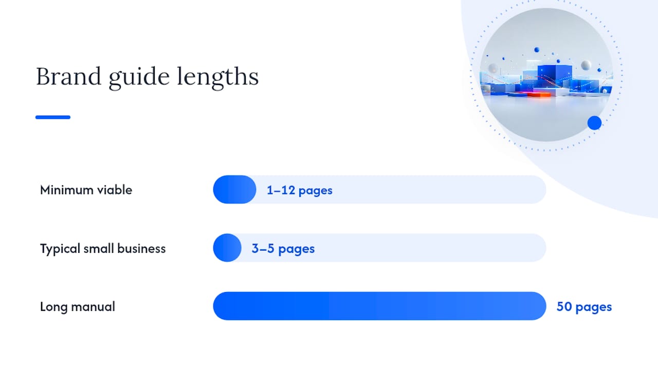
A minimum viable brand guide runs between one and twelve pages, and for most small service businesses, three to five pages covers everything that actually gets used day to day. This range comes directly from Patrick Iverson’s guidance on brand guide length: a concise, living document is more likely to be opened and followed than a fifty-page manual nobody has time to read. Longer isn’t more professional here. It’s just less likely to survive contact with a Tuesday afternoon.
Here’s a page-by-page template that works for a service business with one or two people handling marketing:
That third page matters more than people expect, because it’s the difference between a guide that describes rules and one that shows the outcome. A designer or contractor can look at page three and immediately understand what “on brand” means without decoding page one and two first.
| Hosting option | Best for | Trade-off |
|---|---|---|
| Google Doc | Solo operators, fastest to set up | Weak visual layout control |
| Notion | Small teams needing a linked wiki | Requires everyone to have an account |
| Figma | Teams already designing in Figma | Steeper learning curve for non-designers |
Whichever you choose, set sharing to “anyone with the link can view,” not edit, and keep one person as the sole editor. A guide that five people can silently change stops being a source of truth within a month.
Publishing a guide and using it daily are different problems, and most businesses solve the first without ever solving the second. Real-life mockups and examples-led explanations are consistently the most effective way to get a team applying a brand consistently, which is exactly why page three of the minimum viable template above exists.
The workflow that actually holds up in a small team looks like this: brief, template, approve, publish. Someone requests an asset using a one-line brief (what it’s for, who sees it). They pull from an existing template rather than starting blank. One person checks it against the guide before it goes out. Then it’s published, with the file saved back into the shared brand folder so the next person isn’t starting from zero.
Build templates for the three assets you’ll actually need on repeat:
For onboarding a new freelancer or staff member, a short checklist prevents most brand drift before it starts:
If your work involves outside creators or influencers representing your brand, it’s worth setting expectations the same way you would for staff. Platforms like Black X’s creator-brand certification show one model for formalising that kind of partnership, where both sides agree on presentation standards up front rather than correcting mistakes after the fact.
Examples solve the “what does good look like” problem. They don’t solve the “our team still isn’t using it” problem, which is the one that actually costs businesses money in inconsistent invoices, mismatched social posts and websites that look like they belong to a different company than the emails.
Mybworkshops built its brand identity workshop around that gap specifically. The three-phase structure moves participants from defining brand direction, through building the visual and voice rules, to actually producing the templates a small team needs on day one: a social post, an email header, a proposal cover, the same three assets flagged earlier in this article. Participants leave with a short, living guide, not a PDF that gets opened once and forgotten.
A brand guide only earns its place if the people using it can find it, understand it in under a minute, and apply it without asking someone else first.
That’s the standard worth holding any guide to, whether you build it from the free examples above or work through it with structured help.
You’ve now got real examples to study, a definition of what belongs in a guide, and a template lean enough to finish this week. Where you go from here depends on how much of it you want to build solo versus with structured support.
Doing it yourself with the free resources above works well if you’ve already got some design instinct and mainly need the checklist to keep you honest. Studying NASA’s guide for rigour, then borrowing the one-page structure from a Canva template, gets a workable small-business version of a brand style guide onto paper without spending anything.
Where Mybworkshops changes the equation is speed and accountability: instead of piecing together lessons from a dozen different guides and hoping you’ve covered the gaps, the brand identity workshop walks you through the same decisions in a single structured session, with someone checking your logo rules, colour codes and voice pairs actually hold together before you publish anything. You leave with the guide finished, not a folder of half-decided ideas to revisit next quarter. For a broader look at where brand fits into everything else you’re building, the full workshop archive covers the strategy, website and lead generation pieces that a strong brand foundation is meant to support. Book a session, bring your logo and one competitor example you like, and leave with a guide your whole team can actually use by the end of the day.
A usable brand style guide beats an impressive one, and for most small businesses that means three to five pages built from real examples rather than abstract rules.
| Point | Details |
|---|---|
| Study a range of examples | Compare NASA’s depth against Slack’s restraint to see what scale actually suits your business. |
| Cover five core sections | Include logo rules, colour codes, typography, imagery direction and voice guidelines at minimum. |
| Keep it short and living | Aim for one to twelve pages hosted somewhere shareable, like Notion, Figma or a Google Doc. |
| Show applied examples | A real social post, email header and proposal cover teach consistency faster than written rules. |
| Get structured help if needed | Mybworkshops’ brand identity workshop turns these examples into a finished, usable guide in one session. |
A brand style guide includes logo usage rules, a colour palette with HEX and RGB codes, typography choices with web fallbacks, imagery direction, and voice or tone of voice guidelines, usually paired with real applied examples.
Strong examples to study include NASA’s public brand guidelines for depth, HubSpot’s brand guide PDF for practical clarity, Canva’s style guide templates for accessible small-business formats, and the archive at brandingstyleguides.com for a wide range of real, downloadable guides.
There’s no verified industry standard behind a “3-7-27 rule” in branding, and it isn’t referenced in established brand guideline resources, so treat any specific claim about it with caution rather than as an established framework.
NASA’s brand guidelines and HubSpot’s brand guide PDF are both publicly accessible, full examples of a brand book you can open and study section by section, from logo lockups through to typography and photography rules.
A brand voice guide focuses specifically on tone, word choice and messaging examples, while a full brand style guide adds the visual layer on top, covering logo, colour and typography alongside the voice rules.