

Web page responsive design is the practice of building websites that automatically adjust their layout, content, and functionality to suit any screen size or device. The industry term for this approach is responsive web design (RWD), a standard first formalised by Ethan Marcotte in 2010 and now a baseline expectation for any professional build. Over half of web designers cite lack of responsiveness as the top trigger for a full site redesign. That statistic tells you everything about where the profession stands. Whether you are building from scratch or auditing an existing site, understanding RWD principles is the difference between a site that works and one that quietly loses visitors.
Responsive web design rests on three technical foundations: fluid grids, flexible media, and media queries. Get these right and the rest of the build becomes far more manageable.

A fluid grid uses percentage-based column widths instead of fixed pixel values. When the viewport shrinks, columns shrink proportionally. Nothing breaks. Nothing overflows. CSS Grid and Flexbox are the two layout tools that make fluid grids practical in 2026. CSS Grid handles two-dimensional layouts, rows and columns together. Flexbox handles one-dimensional flows, either a row or a column at a time. Used together, they give you precise control without writing hundreds of lines of custom CSS.
Fixed-width images are one of the fastest ways to break a layout on smaller screens. Setting max-width: 100% on images forces them to scale within their container. For video and embedded content, the padding-hack technique or the newer aspect-ratio CSS property maintains correct proportions across viewports. Optimising images with AVIF and WebP formats combined with lazy loading reduces layout shift and speeds up load times. Both outcomes directly affect your Core Web Vitals scores.
Media queries are CSS rules that apply specific styles when the viewport meets defined conditions. A simple example: @media (max-width: 768px) { ... } applies styles only when the screen is 768 pixels wide or narrower. They are the mechanism that lets one codebase serve a desktop monitor and a phone screen without duplication.
| Principle | How it works | Primary tool |
|---|---|---|
| Fluid grid | Columns scale as percentages of the viewport | CSS Grid, Flexbox |
| Flexible images | Images scale within their container | max-width: 100%, aspect-ratio |
| Media queries | Apply CSS rules at defined viewport widths | CSS @media rules |
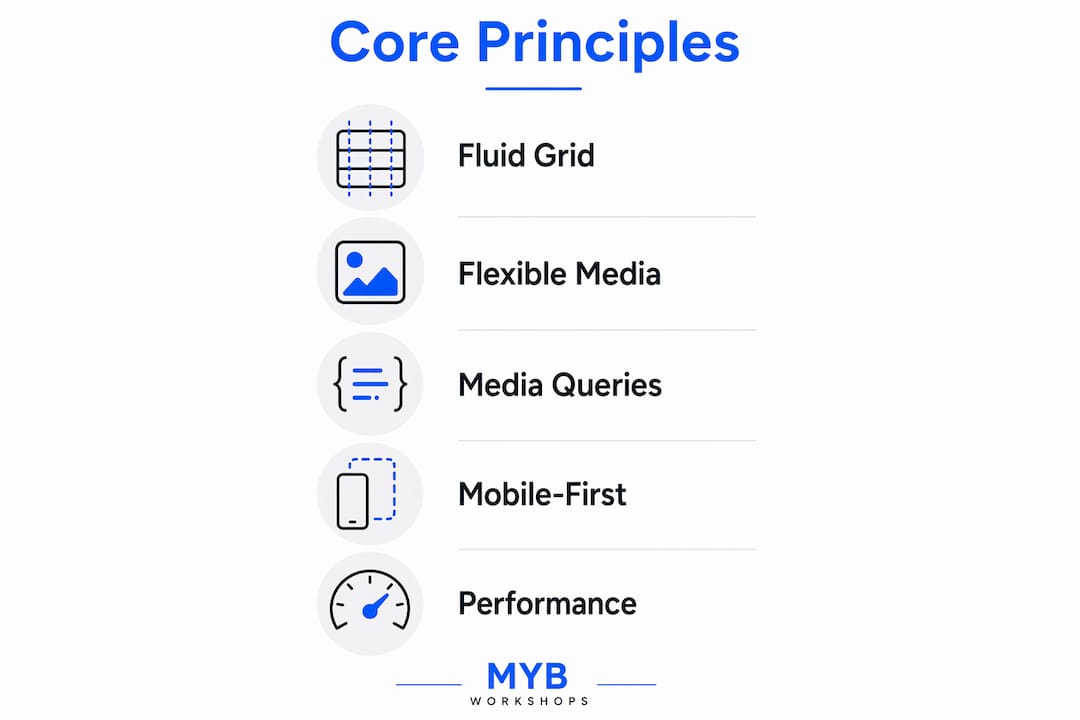
Mobile-first design means you write CSS for the smallest screen first, then use media queries to add complexity for larger screens. This is the opposite of the old desktop-first workflow, where designers built for wide screens and then tried to compress everything down.
Retrofitting desktop-first designs with media queries consistently produces worse results than starting mobile. The reason is simple: when you design for a small screen first, you are forced to decide what actually matters. Navigation, calls-to-action, and key content must earn their place. Nothing is hidden behind a hamburger menu as an afterthought.
The business case for mobile-first is clear. Mobile-first design improves conversion rates by 25–40% and reduces bounce rates significantly. Those are not marginal gains. They reflect the reality that most users now arrive on a phone, and a site that frustrates them on mobile loses them permanently. You can see how this connects directly to website conversion killers that cost service businesses leads every day.
True mobile-friendliness is an outcome, not a method. It requires readability, tappability, and fast load times working together. A site can pass a basic responsiveness check and still be unusable on a phone if the text is too small, the buttons are too close together, or the page takes five seconds to load.
Key mobile-first design requirements:
Pro Tip: Start every new project by wireframing the mobile view first. If your layout cannot communicate its purpose on a 375-pixel-wide screen, it is not ready to scale up.
Breakpoints are the viewport widths at which your layout changes. Choosing them poorly is one of the most common mistakes in responsive builds.
The old approach was to target specific devices: 320px for older iPhones, 768px for iPads, 1024px for laptops. That approach is now obsolete. New devices appear constantly, and no fixed list of widths can keep up. A breakpoint set for a 2022 device will be wrong for a 2026 device.
Content-driven breakpoints maintain layout integrity far better than device-specific ones. The method is straightforward: resize your browser window slowly from wide to narrow and watch your content. Add a breakpoint only when the layout visibly breaks or becomes hard to read. The breakpoint serves the content, not a device catalogue.
Steps to identify content-driven breakpoints:
CSS container queries enable component-level responsiveness that goes beyond what viewport-based media queries can do. Instead of asking “how wide is the screen?”, a container query asks “how wide is this component’s parent container?” This matters for modular design systems where the same card component might appear in a narrow sidebar or a wide main column. With container queries, the card adapts to its container, not the screen.
| Breakpoint range | Typical layout behaviour |
|---|---|
| 0–599px | Single column, stacked content |
| 600–899px | Two-column grid, simplified nav |
| 900–1199px | Three-column grid, expanded nav |
| 1200px and above | Full desktop layout, multi-column |
Performance and accessibility are not optional extras in responsive design. They are the standard. Google’s Core Web Vitals measure real-world user experience, and poor scores affect both rankings and conversions.
Use AVIF or WebP formats for all images. Both formats deliver smaller file sizes than JPEG or PNG at equivalent quality. Add the loading="lazy" attribute to images below the fold so they only load when the user scrolls to them. This reduces initial page weight and improves LCP scores. For responsive images, use the srcset attribute to serve different image sizes to different screen widths.
Body text on mobile should be at least 16px. Anything smaller forces users to pinch and zoom, which breaks the experience immediately. Line height of 1.5 to 1.6 improves readability on small screens. Avoid long line lengths on desktop: 60–75 characters per line is the readable range. Use relative units like rem and em for font sizes so they scale with user preferences.
Every interactive element, buttons, links, form fields, needs a minimum tap target of 48×48 pixels. Space interactive elements at least 8px apart to prevent accidental taps. Test your forms on a real phone, not just in browser developer tools. Placing core calls-to-action in the thumb zone measurably increases mobile engagement.
Browser developer tools are useful for quick checks, but they do not replicate real device behaviour. Test on actual phones and tablets at different stages of the build. Pay particular attention to how touch events behave, how fonts render, and how long the page takes to load on a mobile data connection. If your site needs rebuilding because it was never built mobile-first, real device testing will reveal exactly where to start.
Pro Tip: Never retrofit a desktop design by adding media queries at the end of a project. That approach produces fragile, hard-to-maintain code. Build mobile-first from day one and your codebase will be cleaner and your users will notice.
Responsive web design built on fluid grids, mobile-first workflows, and content-driven breakpoints produces sites that perform well, convert better, and hold up across every device.
| Point | Details |
|---|---|
| Mobile-first is the standard | Design for the smallest screen first to prioritise content and improve conversions. |
| Content-driven breakpoints last longer | Add breakpoints when your layout breaks, not to match specific device widths. |
| Tap targets and load times are measurable | Minimum 48×48 pixel targets and LCP under 2.5 seconds are professional benchmarks. |
| Container queries add flexibility | CSS container queries let components adapt to their parent, not just the viewport. |
| Image optimisation affects Core Web Vitals | Use AVIF or WebP with lazy loading to reduce layout shift and speed up load times. |
A technically sound responsive website is one part of a broader system that attracts and converts clients. Mybworkshops runs structured, expert-led workshops that cover website strategy, UX, and the practical skills behind high-converting web design. Each workshop is built for service-based business owners and the designers who support them.

If you want to go beyond the basics and build websites that actually grow a business, the Mybworkshops programme gives you a structured path to do exactly that. You will work through real strategy, not theory, with mentorship and tools that make the difference between a site that looks good and one that performs.
Responsive web design (RWD) is a development approach where a website’s layout automatically adjusts to fit any screen size using fluid grids, flexible images, and CSS media queries.
Mobile-first is a workflow within responsive design where you write CSS for small screens first and progressively add styles for larger screens, rather than starting with desktop and scaling down.
Content-driven breakpoints are set at the exact widths where a layout visually breaks, rather than targeting specific device widths that quickly become outdated.
Professional standards set the minimum tap target at 48×48 pixels to prevent mis-taps and maintain usability on touchscreen devices.
CSS container queries allow components to adapt their styles based on the size of their parent container rather than the overall viewport, enabling more modular and flexible design systems.