
A homepage hero has one job: trigger the next action, whether that’s a scroll, a click or a sign-up. It does that by pairing a clear outcome statement with one primary call to action. This guide breaks down the five proven layout patterns, the components worth auditing, ten real-world examples, and a seven-step checklist you can run on your own site this week.
TL;DR:
- The hero’s layout pattern should match the audience and funnel stage, with split-screen or product visuals working best for familiar categories.
- The headline must clearly state the outcome in six to ten words, ensuring it isn’t overshadowed by the visual hierarchy.
- A single, outcome-oriented call to action outperforms multiple buttons unless each serves a distinct visitor intent.
- Mobile load speed, accessibility, and visual clarity are critical for conversions and should be tested regularly.
- An audit focusing on headline clarity, CTA prominence, visual match, and mobile performance can significantly improve user engagement without a full redesign.
Before picking a layout, it helps to understand why the hero carries so much weight in the first place. Eye-tracking studies show visitors spend roughly 80% of their attention on content visible without scrolling, and the hero is what decides whether someone stays or bounces. That single section has to answer three questions almost instantly: what is this, why should I care, and what do I do next. Miss any one of those and the rest of your homepage rarely gets read.
That’s why looking at strong hero section examples matters more than chasing trends. A pattern that works for a software company might sink a tradie’s website, because the audience, the funnel stage, and the visual assets available are all different. The goal isn’t to copy a layout wholesale. It’s to understand the mechanics behind it, then adapt.
Design guides consistently point to the same handful of layout patterns that convert, each suited to a different kind of business and audience:
Cold audiences generally respond better to bold typographic claims or outcome imagery, while warmer, more solution-aware visitors respond better to product screenshots or short demos, according to pattern guidance from hero design research.
Layout is only half the equation. The words and visuals sitting inside that layout do the actual persuading, and each component has its own rule of thumb.
Pro Tip: Print your homepage hero at actual size, pin it to a wall, and walk ten metres back. If you can’t tell what the business does or what to click, neither can a visitor scrolling on their phone.
Clear, benefit-led CTA wording matters more than most business owners realise. Getting this right is exactly what strong calls to action are built around.
These examples map to the patterns above, and every one carries a single takeaway you can apply without redesigning your whole site.
Curated galleries are a useful starting point for inspiration, but design libraries only earn their keep when you filter examples against your own audience and funnel stage, not just their visual appeal.
A hero that looks brilliant on a 27 inch monitor can fail completely on a phone, and phones are where most first impressions now happen.
Every hero benefits from a structured look rather than a gut-feel redesign. Here’s the audit we walk through in a single working session.
This sequence draws on the same audit framework practitioners use to find quick wins before committing to a full redesign.
Pro Tip: Run this audit before you touch your ad spend. A confusing hero wastes every click a campaign sends to it, no matter how well the campaign itself is built.
The workflow that follows is always the same three phases: clarify the value proposition first, prototype and test a small number of changes, then iterate based on what visitors actually do. One service business that ran this exact audit inside a workshop session found their original hero buried the offer under three paragraphs of company history. Rewriting the headline to state the outcome directly, cutting to one CTA, and fixing mobile load time led to a clear lift in enquiry form completions within weeks, without changing a single ad or increasing spend. This kind of foundational fix is what website strategy that leads the user journey into conversions is designed to teach.
Hero design keeps shifting as tools and attention spans change, and a few directions stand out heading into 2026.
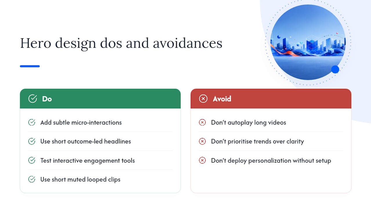
Micro-interactions are replacing static imagery on more product-led sites, small hover effects, subtle cursor-based animation, or a headline that shifts slightly on scroll. Used sparingly, these add polish without the load-time cost of full video. Personalised hero content, where the headline or CTA changes based on a visitor’s traffic source or location, is becoming more common on larger sites, though it demands more technical setup than most small businesses need to bother with.
Shorter, punchier headlines are also winning out over the clever, ambiguous taglines that were popular a few years back. Visitors want the outcome stated plainly, not decoded. Alongside that, more sites are testing interactive elements, quizzes, calculators, configurators, that double as both engagement tools and lead qualifiers.
Dark mode and high-contrast colour palettes have moved from a novelty to a genuine design choice, particularly for technical and creative audiences, though contrast and accessibility still need checking either way. And video continues to grow in the hero, but the trend is toward short, muted, looped clips rather than the long autoplay videos that used to dominate, a shift driven directly by the load-time and attention problems autoplay video creates.
None of these trends replace the fundamentals. A clever micro-interaction on top of a confusing headline still fails the same way a plain hero with a confusing headline does. Trends are worth testing once the basics, outcome, clarity, one CTA, are already solid.
The right hero pattern shifts depending on what you’re selling and how familiar your audience already is with the category.
Professional services (accountants, consultants, coaches) tend to do best with a centred or split hero, a plain-language outcome headline, and a booking CTA rather than a generic “contact us.” Trades and local services benefit from simplicity above almost everything else: a clear service area, a phone number CTA, and a photo of real work rather than stock imagery. Hospitality and lifestyle brands lean hardest on full-bleed visual heroes, because the image itself is the pitch, though text contrast needs careful checking against busy photography.
Software and product-led businesses generally perform best with split-screen layouts showing the actual product, or a short demo video once the audience is far enough along to understand the category. E-commerce homepages often combine a strong product or lifestyle image with a promotional or seasonal CTA, though the core rule still applies: one dominant action, not five.
Nonprofits and cause-driven organisations tend to succeed with outcome-focused imagery, showing the people or result their work supports, paired with a single donation or sign-up CTA rather than a menu of options. Across every one of these, the pattern that fails hardest is the same: an unclear headline paired with three competing CTAs, regardless of industry.
Reading examples is useful, but most business owners already know their hero isn’t pulling its weight. The gap is usually between knowing something’s wrong and knowing exactly what to change first. That’s the problem our workshops are built to solve, working through your actual homepage, not a hypothetical one, alongside people facing the same conversion problems.
The Write Compelling Copy workshop walks through headline and CTA writing in detail if that’s where your hero is weakest, and the wider workshop catalogue covers everything from brand foundations to website strategy for businesses that need more than a single fix. If you want to see what a properly structured overhaul looks like, the examples of businesses built through workshops page is worth a look before you book anything.
For deeper detail on the research behind this guide, Prismic’s hero section best practices covers eye-tracking data in full, while Spell.sh’s hero guidance breaks down layout hierarchy further. For visual inspiration once you know what pattern suits your audience, ctrl alt orion is a useful browsing resource. Business owners wanting a practical starting checklist can also read 5 tips for creating a high-converting website.
A homepage hero is the large section at the top of a website, visible before scrolling, that combines a headline, supporting copy, a call to action and usually an image or video to tell a visitor what the site offers and what to do next.
A common example is a split-screen layout with a benefit-led headline and CTA on the left and a product screenshot or outcome photo on the right, a pattern used widely across service and software homepages.
Strong homepages typically pair one of the five core hero patterns, centred, split, full-bleed, typographic or interactive, with a headline that states an outcome in six to ten words and a single dominant CTA above the fold.
Effective hero images generally fall into three categories: outcome imagery showing the result a customer gets, product screenshots for audiences already familiar with the offer, and short looped video demonstrating use rather than static aesthetics.