

A call to action (CTA) is the single website element that converts visitors into measurable next steps: a booking, a call, a quote request. Without one, your site is a brochure. With a well-placed, well-worded CTA, it becomes your best-performing salesperson.
Conversion-focused sites differ from brochure sites in one structural way: every page drives a single primary action, that action is repeated, and the path to it has minimal friction. The core elements that make this work are:
For Australian service businesses, shifting from a brochure site to a conversion-focused structure commonly lifts conversions 3–8×, with the investment often paying back in 6–12 weeks.
A CTA creates a measurable next step. Without it, web traffic stays traffic. With it, traffic becomes a sales activity you can track, improve, and scale.
The business effects are direct. A clear call to action is often the single most effective change a small business can make to increase enquiries without buying more traffic. Higher conversion rates mean a lower cost per enquiry. Fewer vague “just enquiring” contacts mean less wasted time in your sales process.
Pro Tip: Treat your website like a salesperson. A good salesperson doesn’t leave a prospect standing in silence. They ask a clear, low-pressure question that moves things forward. Your CTA does the same job.

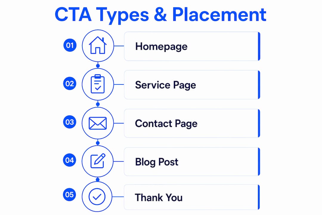
Different service intents call for different CTA types. Matching the right one to the right page reduces friction and lifts conversions.
Common CTA types for service businesses:
Placement rules that consistently work:
| Page type | Primary CTA | Secondary CTA |
|---|---|---|
| Homepage | “Book a free consult” / “Get a quote” | “See how it works” |
| Service page | “Request a fixed-price quote” | “Call us now” |
| Blog post | Lead magnet or “Book a call” | Newsletter sign-up |
Pro Tip: Pick one primary path and make alternatives visually subordinate. Too many equally visible options cause choice paralysis. One strong CTA, one softer secondary option at most.
The visual and copy rules for high-converting CTAs are straightforward. Most businesses get them wrong in the same ways.
Visual and accessibility checklist:
CTA copy formulas that work:
The best-performing labels follow a simple pattern: outcome + action + low barrier. For example:
Avoid “Submit”, “Click here”, or “Contact us.” These tell the visitor nothing about what happens next.
What not to do:
Pairing your CTA with a trust signal (a star rating, a “200+ jobs completed” line, or a short testimonial) closes the confidence gap visitors feel before they commit. Outcome-led CTA copy aligned to visitor intent consistently outperforms generic button labels.
Pro Tip: Basic fixes like shorter forms, visible CTAs above the fold, and added testimonials typically lead to noticeable improvements in conversions within a few weeks.
A CTA is only as useful as the workflow it feeds. Design the follow-up before you publish the button.
Simple workflow maps by CTA type:
Form fields that balance qualification and friction:
Avoid date of birth, company registration number, or any field that feels like a government form. Each unnecessary field reduces completion rates.
A micro-qualification step, such as a short dropdown (“What best describes your situation?”), filters unsuitable enquiries without adding significant friction. It also helps you triage and prioritise responses.
Pro Tip: Integrate your CTA form with a CRM or simple automation so the first response sets clear expectations. “Thanks, we’ll call within 2 business hours” reduces anxiety and stops leads from contacting a competitor while they wait.
You cannot improve what you do not measure. These are the metrics that matter.
| Metric | Type | What it tells you |
|---|---|---|
| Conversion rate | Primary | % of visitors who complete the CTA |
| Cost per enquiry | Primary | Ad spend ÷ enquiries generated |
| Lead quality % | Primary | % of enquiries that become real opportunities |
| Click-through rate | Primary | % of visitors who click the CTA button |
| Time on page | Secondary | Whether visitors are reading before deciding |
| Scroll depth | Secondary | Whether visitors reach the CTA at all |
Tools to use (available in Australia):
Simple A/B test plan:
Pro Tip: The most common testing mistake is stopping too early. A week of data with 20 conversions proves nothing. Patience here saves you from making changes that hurt rather than help.
These are low-cost, high-impact fixes. Most take hours, not weeks.
tel: so one tap dials.Timeline: changes one, two, three, five, and six take under an hour each. Changes four and seven take a day. Expect to see movement in your enquiry volume within 2–4 weeks of implementing all seven.
Pro Tip: Prioritise friction reduction and clarity first. A visitor who understands what you do and sees an obvious, low-risk next step will convert. Everything else is secondary.
Most conversion problems come from the same short list of errors.
Do-not-do list:
60-second red-flag scan for any page:
If you answer “no” to any of these, that page is losing leads right now. Accessibility improvements, particularly contrast and focus states, also tend to improve overall usability and completion rates across the board.
The conversion data from Australian service businesses is consistent. Moving from a brochure-style site to a conversion-focused structure, where every page drives a single measurable next action, commonly lifts conversions 3–8× on the same traffic.
Practical fixes—shorter forms, visible CTAs, and testimonials placed near the enquiry point—typically improve conversion rates by 30–60% within 2–3 weeks, based on practitioner guidance from Australian service-site audits.
A high-converting service page acts like a structured sales conversation: it names the problem, explains the solution, shows proof, sets expectations, and makes the next step feel like the obvious conclusion. The CTA at the bottom of that page should feel earned, not bolted on.
The pattern across these examples is the same: clarity, proof, and a single obvious next step. That combination is what separates sites that generate enquiries from sites that generate traffic.
A well-placed, value-led CTA, paired with trust signals and a simple form, is the fastest way for Australian service businesses to lift enquiries from existing traffic.
| Point | Details |
|---|---|
| One primary CTA per page | Pick one action and make alternatives visually subordinate to avoid choice paralysis. |
| Place CTA above the fold | Visitors who must scroll to find the CTA often leave before they reach it. |
| Pair CTAs with proof | A testimonial or result stat adjacent to the CTA closes the confidence gap and lifts conversions. |
| Measure before you change | Track conversion rate, cost per enquiry, and lead quality before and after any change. |
| Mybworkshops three-phase approach | Mybworkshops workshops guide owners through diagnosing CTA gaps, implementing fixes, and measuring results. |
If you’ve read this and thought “I know what needs fixing but I’m not sure how to do it properly,” that’s exactly where Mybworkshops comes in.
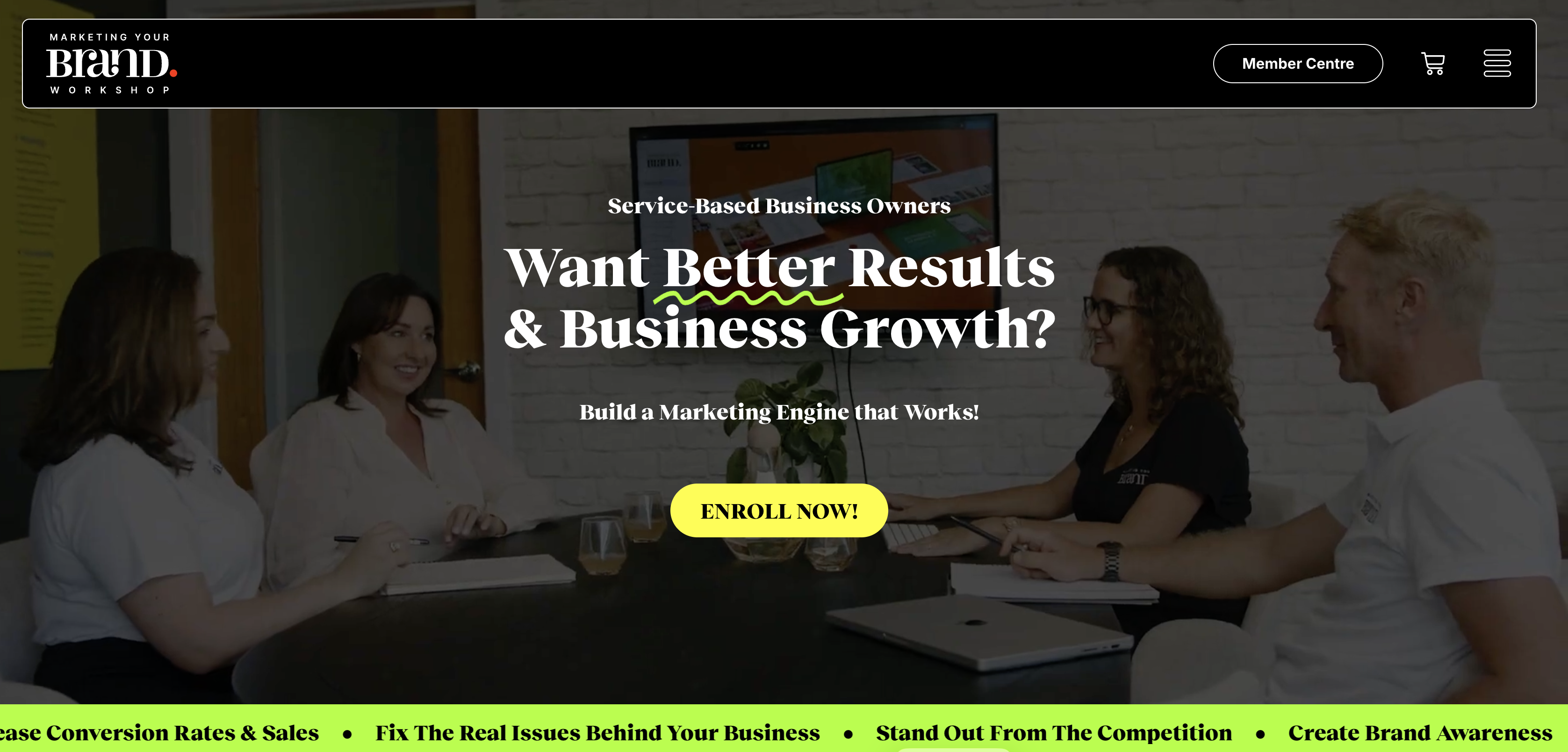
The Mybworkshops programme runs through three practical phases: diagnose what’s costing you leads, implement CTA and copy improvements with hands-on guidance, then measure results and refine. You work through real copy, placement tests, and workflow integration, not theory. Mentorship and practical tools are built into every session, so you leave with changes you can apply immediately, not a slide deck to file away.
Owners who’ve been through the programme report clearer websites, better-quality enquiries, and less wasted ad spend. You can see examples of businesses built through workshops on the Mybworkshops site.
Ready to fix your CTAs with a clear plan behind you? Browse the available workshops and find the session that fits where you are right now.
These resources are worth bookmarking if you want to go deeper on any part of this topic.
A CTA turns passive visitors into measurable next steps, such as bookings, calls, or quote requests. Without one, traffic has nowhere to go and enquiries don’t happen.
One primary CTA, repeated two to four times down the page depending on length. A softer secondary option (such as “See how it works”) is fine, but it should be visually subordinate to the main action.
Labels that follow the pattern “outcome + action + low barrier” consistently outperform generic options. Examples include “Book a free 15-min consult” or “Get a fixed-price quote in 48 hours.”
Practical fixes like shorter forms, visible CTAs, and added testimonials typically improve conversion rates by 30–60% within 2–3 weeks, based on Australian service-site practitioner guidance.
Mybworkshops runs structured workshops that take owners through diagnosing CTA gaps, writing better copy, testing placement, and integrating leads into a sales workflow, with mentorship built into every session.