
Website conversion rate optimisation is the practice of turning existing website visitors into paying clients, without spending more on traffic. For Australian service businesses, this matters more than most owners realise. Conversion rates for Australian service businesses typically sit between 2% and 3%, with top performers reaching 4% to 6%. A rate below 1% signals a structural problem with your site, not a traffic problem. The most direct way to turn website visitors into clients is to fix what is already broken before you spend another dollar on ads or SEO.
Getting the foundations right saves you from making changes that look good but do nothing. Before you touch a single button or rewrite a headline, set up the tools that show you what is actually happening on your site.
The non-negotiables are:
The right mindset matters as much as the right tools. Conversion work is not a one-time fix. It is a cycle of testing, observing, and improving. Business owners who treat it as an ongoing process consistently outperform those who make one round of changes and walk away.
Pro Tip: Set up Google Analytics goal tracking before you make any changes. Without a baseline, you cannot measure whether your improvements are working.

This is where the real work happens. The following steps are ordered by impact. Start at the top and work your way down.
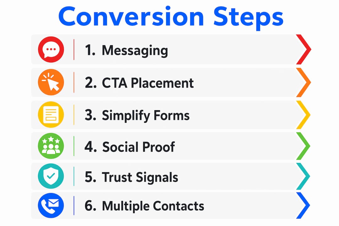
Your homepage headline is not the place for your business name or a clever tagline. It is the place to tell a visitor, in plain language, exactly what you do and who you do it for. A headline like “Accounting for tradies in Melbourne” outperforms “Welcome to Smith & Co” every time. Visitors decide within seconds whether they are in the right place. Make that decision easy for them.
Your body copy should follow the same logic. Lead with the client’s problem, then explain how you solve it, then tell them what to do next. This structure works because it mirrors how a potential client is already thinking when they land on your page.
A call-to-action (CTA) is the button or link that tells a visitor what to do next. “Book a free call,” “Get a quote,” and “Send us a message” are all CTAs. The rule is simple: your primary CTA must be visible without scrolling on every page that matters. Prominent CTAs placed above the fold can improve conversion rates by 30–60% within weeks. That is a significant return for a change that costs nothing but time.
Mybworkshops covers this in detail, including how to write CTA copy that actually gets clicked. Their guidance on effective CTA buttons is worth reading before you make any changes to your pages.
Most contact forms ask for too much. Name, email, phone, business name, budget range, how did you hear about us. Every extra field is a reason for a visitor to give up. Reducing form fields to 3–4 essentials raises conversion rates measurably. Ask for what you genuinely need to follow up, nothing more.
On mobile, make your phone number a clickable link. A visitor on their phone who wants to call you should not have to copy and paste a number. One tap should connect them. Adding local contact details, including your service area suburbs, can lift conversions by up to 25%.
Testimonials buried on a separate “Reviews” page do almost nothing for conversion. Testimonials placed adjacent to enquiry forms reduce friction and increase the likelihood that a visitor will submit their details. The logic is straightforward: a visitor who is about to take a risk wants reassurance at the exact moment they feel uncertain.
Use real names, real outcomes, and specific results wherever possible. “Sarah saved 6 hours a week after switching to our bookkeeping service” is far more persuasive than “Great service, highly recommend.”
Every webpage must build credibility through bios, credentials, case studies, and clear explanations of what happens after a visitor contacts you. High-value service clients want to know who they are dealing with before they hand over their details. Your ABN, professional memberships, industry awards, and client logos all serve this purpose.
The “what happens next” question is one most service websites fail to answer. Add a simple three-step process below your contact form: “1. You send us a message. 2. We call you within 24 hours. 3. We send you a proposal.” That single addition removes a significant amount of anxiety for prospective clients.
Some visitors will fill in a form. Others will only call. Some prefer to send a direct email. Simplifying the enquiry process with multiple contact options raises conversion rates because it removes the friction of forcing everyone through a single channel. If you can manage it, live chat captures leads from visitors who have a quick question but are not ready to commit to a form submission.
Pro Tip: List your phone number in the top right corner of your website header. It is the first place visitors look when they want to call, and making it easy to find is one of the simplest wins available to any service business.
The table below summarises the impact level and effort required for each step.
| Optimisation step | Impact on conversions | Effort to implement |
|---|---|---|
| Benefit-driven headline | High | Low |
| CTA above the fold | High | Low |
| Simplified contact form | High | Low |
| Social proof next to CTAs | High | Medium |
| Trust signals on every page | Medium | Medium |
| Multiple contact options | Medium | Low |
Most Australian service businesses do not have enough monthly traffic to run formal A/B tests. Sites with under 1,000 monthly visitors cannot rely on split testing to reach statistically valid conclusions. That does not mean you cannot improve. It means you use different methods.
The most effective approach for lower-traffic sites combines three things:
When you identify a friction point, fix the most impactful and easiest changes first. A confusing headline is faster to fix than a broken booking system, and it often has a bigger effect. Track your conversion rate monthly so you can see whether changes are working.
Pro Tip: Ask every new client one question during onboarding: “Was there anything on our website that almost put you off contacting us?” The answers will tell you more than any analytics tool.
Common friction points that heuristic reviews consistently uncover include:
Prioritise fixes based on two factors: how much impact the change is likely to have, and how quickly you can implement it. A high-converting website is built through consistent small improvements, not a single redesign.
The most common mistake is treating a website like a digital brochure. Service business owners who treat websites as static brochures rather than lead-generation tools consistently underperform. Every element on a page should move a visitor toward a specific action or it should not be there.
Other mistakes that regularly cost service businesses leads include:
The conversion killers on most service websites are rarely technical. They are structural and strategic. Fixing them does not require a full redesign. It requires a clear understanding of what your visitor needs to feel confident enough to contact you.
Doubling your conversion rate doubles your leads at no extra traffic cost. For a business spending money on Google Ads or SEO, that is the highest-return change available.
Converting website visitors into paying clients requires fixing your site’s messaging, trust signals, and contact process before investing in more traffic.
| Point | Details |
|---|---|
| Fix conversion before buying traffic | Lifting your rate from 1% to 3% triples leads without extra ad spend. |
| CTAs above the fold drive results | Prominent calls-to-action placed before the scroll can lift conversions by 30–60%. |
| Simplify your contact form | Limit fields to 3–4 essentials and make phone numbers clickable on mobile. |
| Place social proof next to CTAs | Testimonials beside enquiry forms reduce hesitation at the moment it matters most. |
| Use heatmaps over A/B tests | Low-traffic sites get better results from session recordings and user interviews. |
Getting your website to work as a genuine lead-generation tool takes more than a checklist. It takes a clear strategy, the right structure, and the confidence to make decisions based on evidence rather than guesswork.
Mybworkshops runs practical, expert-led workshops built specifically for Australian service business owners who want to attract more clients and convert more of the traffic they already have. The workshop programme covers website conversion, lead generation systems, and marketing strategy in a structured format that gives you real skills, not just theory. If you are ready to build a website that works harder for your business, the free masterclass is a strong place to start.
Australian service businesses typically convert 2% to 3% of visitors, with top performers reaching 4% to 6%. A rate below 1% signals a structural problem that needs fixing before any traffic investment makes sense.
Focus on your messaging, CTA placement, contact form simplicity, and trust signals. Lifting conversion from 1% to 3% triples your leads without spending more on ads or SEO.
Place testimonials directly next to your enquiry forms and calls-to-action. Social proof adjacent to CTAs reduces friction and increases conversions far more effectively than a dedicated reviews page.
Yes. Heuristic methods like heatmaps and user interviews identify conversion barriers effectively for sites with low monthly traffic. Most Australian service businesses get better results from qualitative methods than from formal split testing.
Add a benefit-driven headline to your homepage and place a clear CTA above the fold. These two changes require no technical work and consistently produce the fastest measurable improvement in lead volume.